
Back
Web app update
- Improved
- Katja Pozeb
- on 2023/12/01

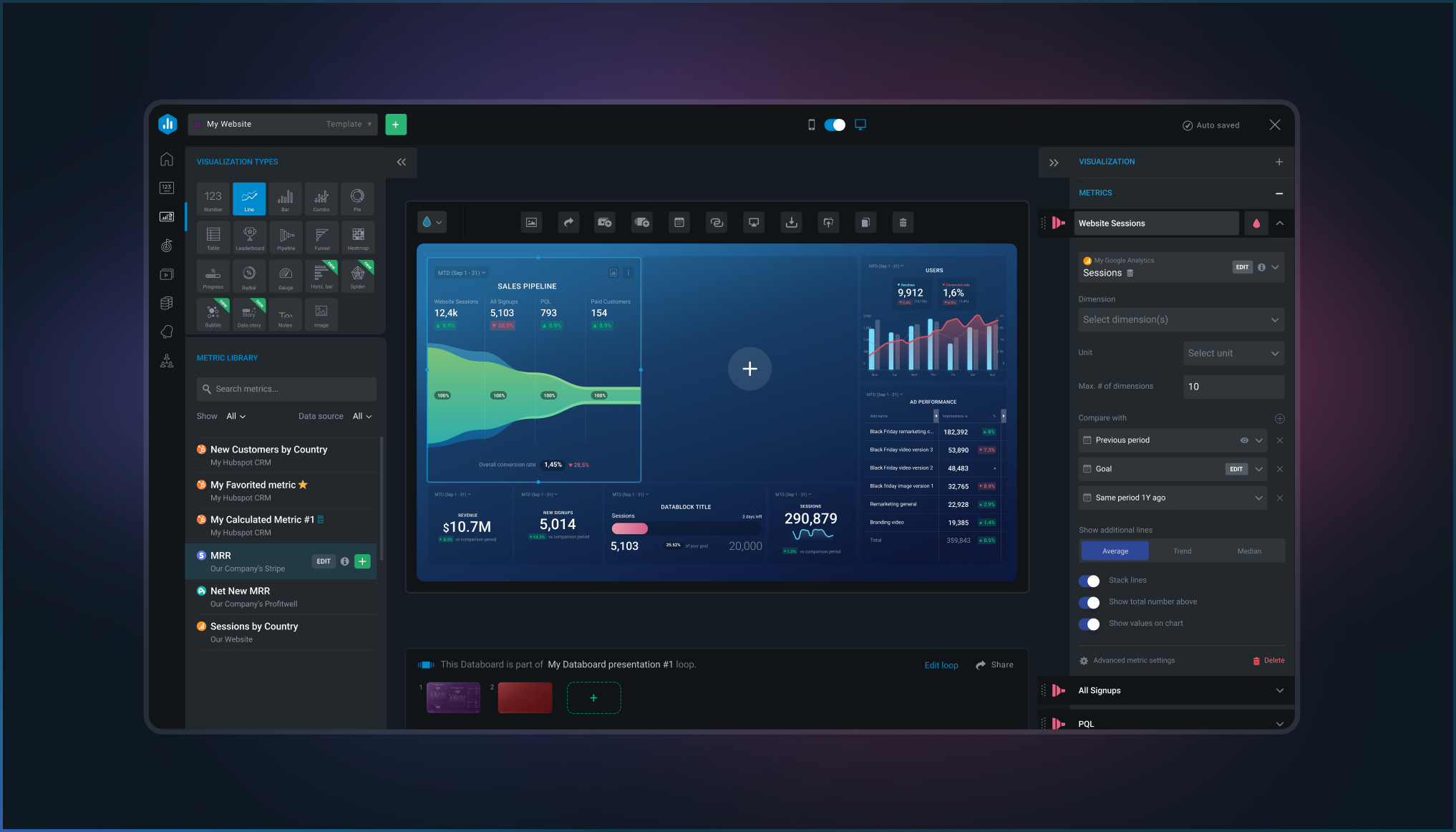
NEW visualization types and more powerful charts are here
We've added new visualization types and improved existing charts to give users the flexibility to explore the data however they want.
Now users can:
- Use advanced charts to make complex data easy to understand - Radial Progress, Spiderweb Diagrams, Bubble Charts, Data story, and more.
- Add multiple metrics to a single visualization to see how different metrics relate.
- Change the colors of individual Metrics to make it easier to identify growth opportunities.
- Quickly switch between different visualization types to find the best way to represent your data.
As part of this update, we've deprecated and transitioned some of the visualizations to the new visualization types.
Read more about it here.
Want to learn more?
Check out our blog for all the details.